Redesign - BookMyBox App
Improving Venue Booking Experience
Project Type: Personal
Duration: 2 Weeks
Project Type: Personal
Duration: 2 Weeks
Redesign - BookMyBox App
Improving Venue Booking Experience
Product Overview
BookMyBox is a mobile application designed to simplify finding and booking gaming venues for individuals and businesses.
While the current application version offers basic functionality, opportunities exist to enhance user experience and address usability issues.
Responsibility
UI/UX Designer
Understanding the current application
Recently i went to my home in Rajkot Gujarat, were my friends and i planned to meet and decided to play sports like the old times, and we found out about a newly launched app which helps users to book courts.
so we decided to book a Volleyball court from a nearby venue.
BUT
when we opened the app we found many issue with user experience and user interface, that it demotivated us to make the booking from the app, but we still continued to book the venue.
Below i have explained pain points in booking the venue in detail.
As soon as we login we have the home screen.
The location was not based on area, we had to use google map and find nearby venues and search that venue in app, which was not good experience.
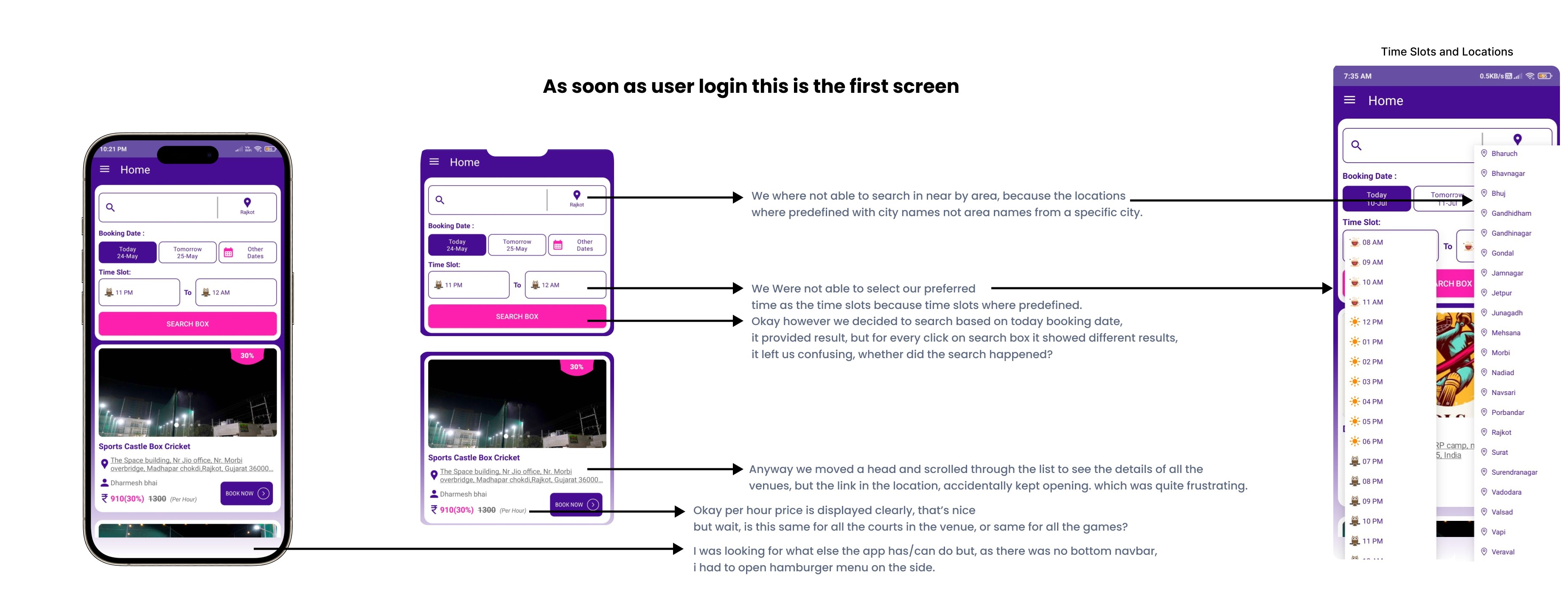
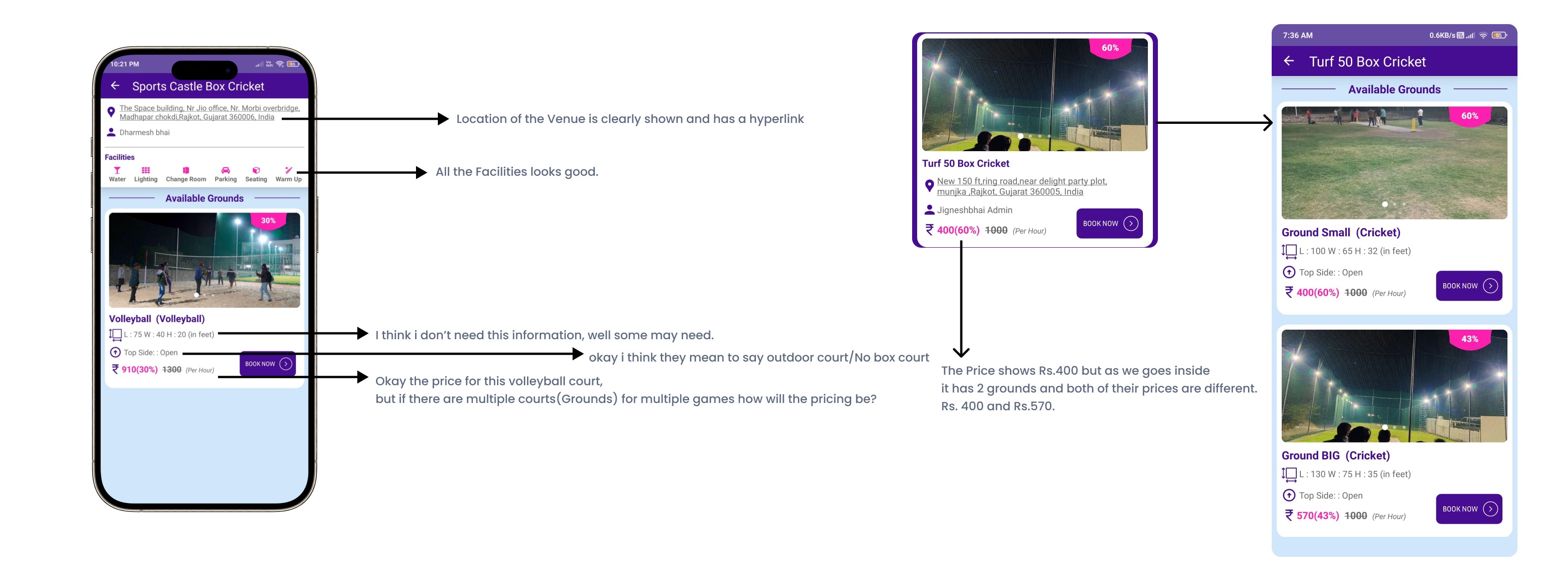


Well anyway, we selected a venue and tried to book by clicking the Book Now Button, it displayed the venue details with available court(Ground) etc.
By this time I was having one question. Available court does this venue have only volleyball courts (only one sport is available) or are any other courts(Sports) also available but are currently not available?
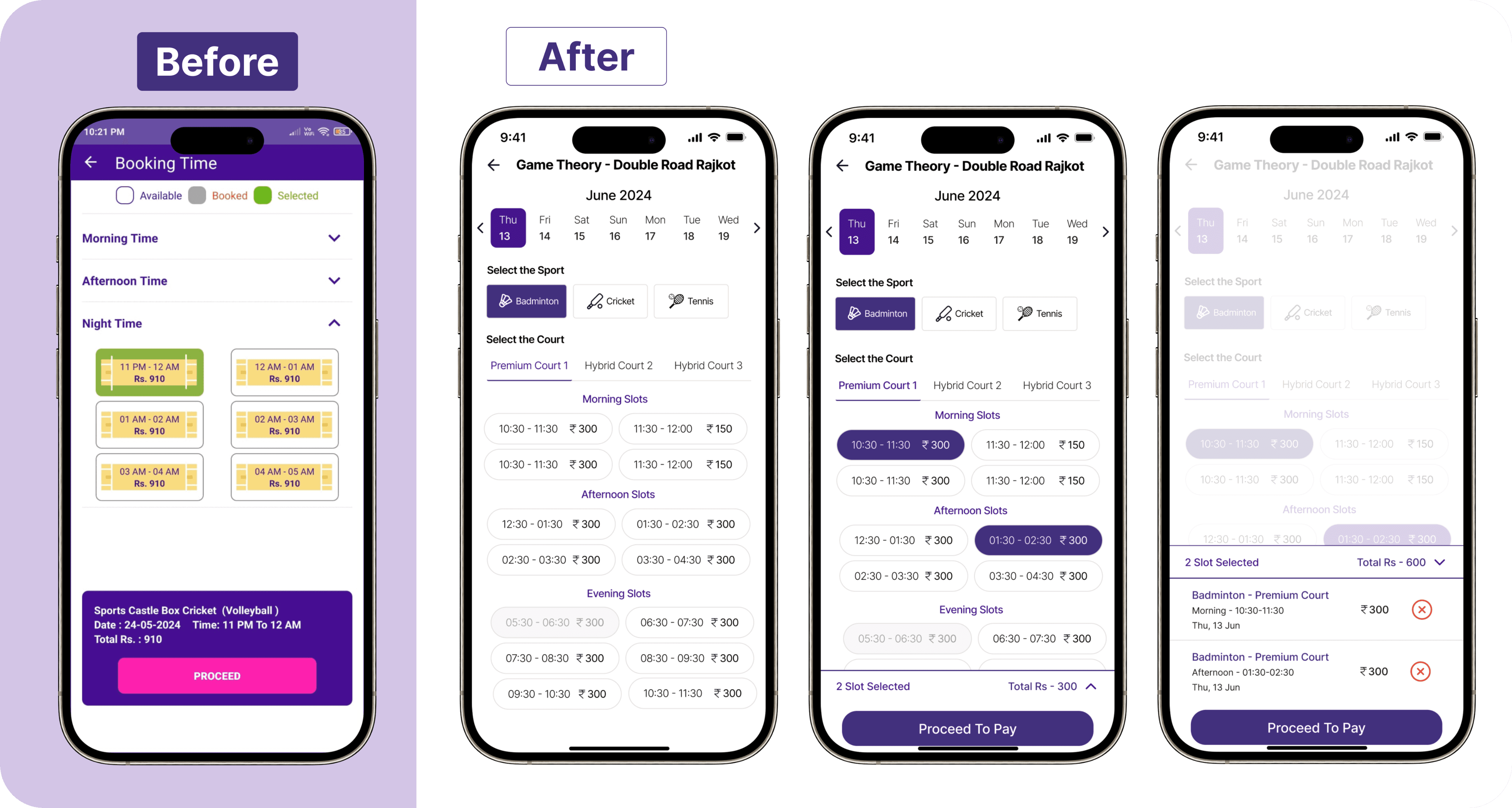
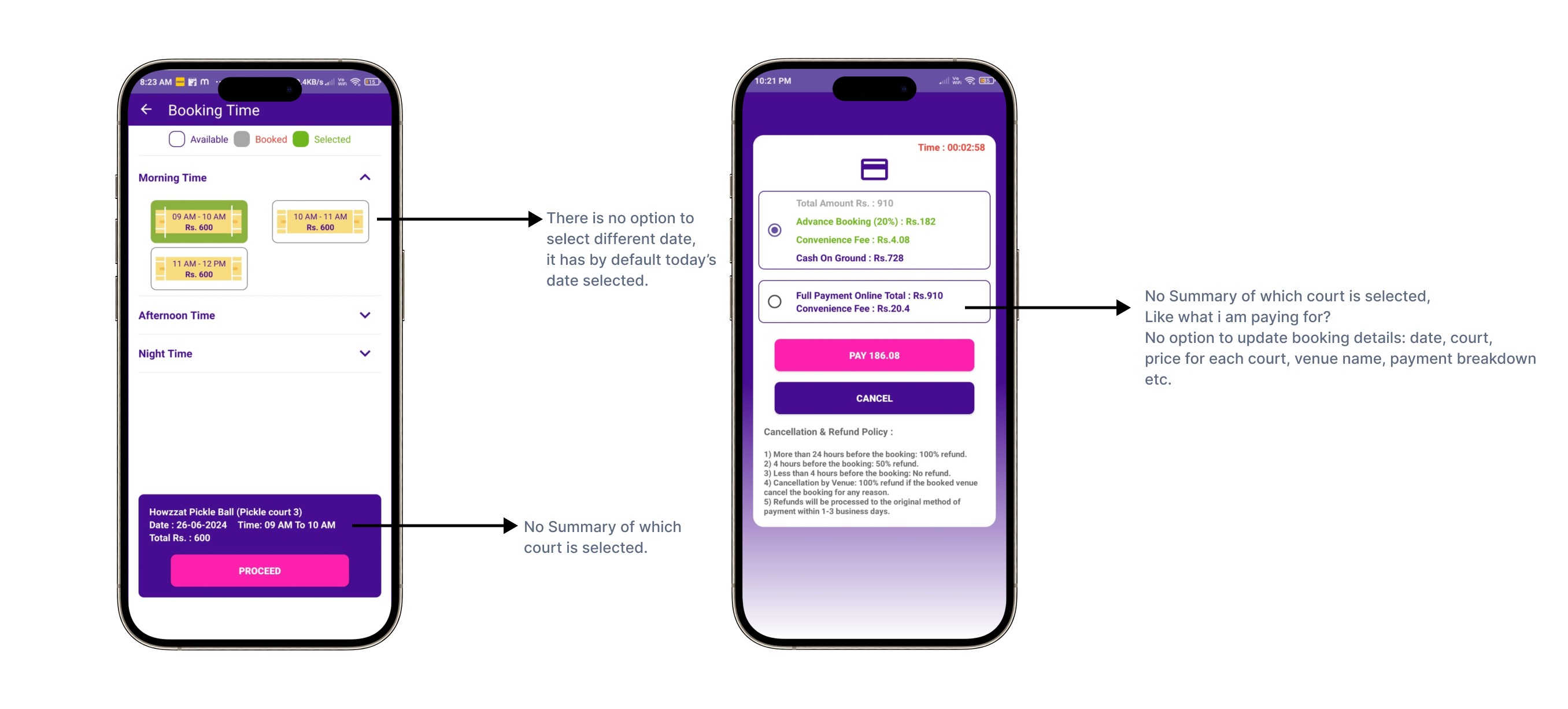
Now we moved ahead with selecting slots but found out that the slot can be booked for that day, if you want to change the date you need to go to the home screen select the date and apply search, based on the search result it will show available venues and continue the process of booking.
Anyway, we could not find our desired slot and nearby venue in the app, so we dropped the plan to play.
But I moved ahead with the payment screen.
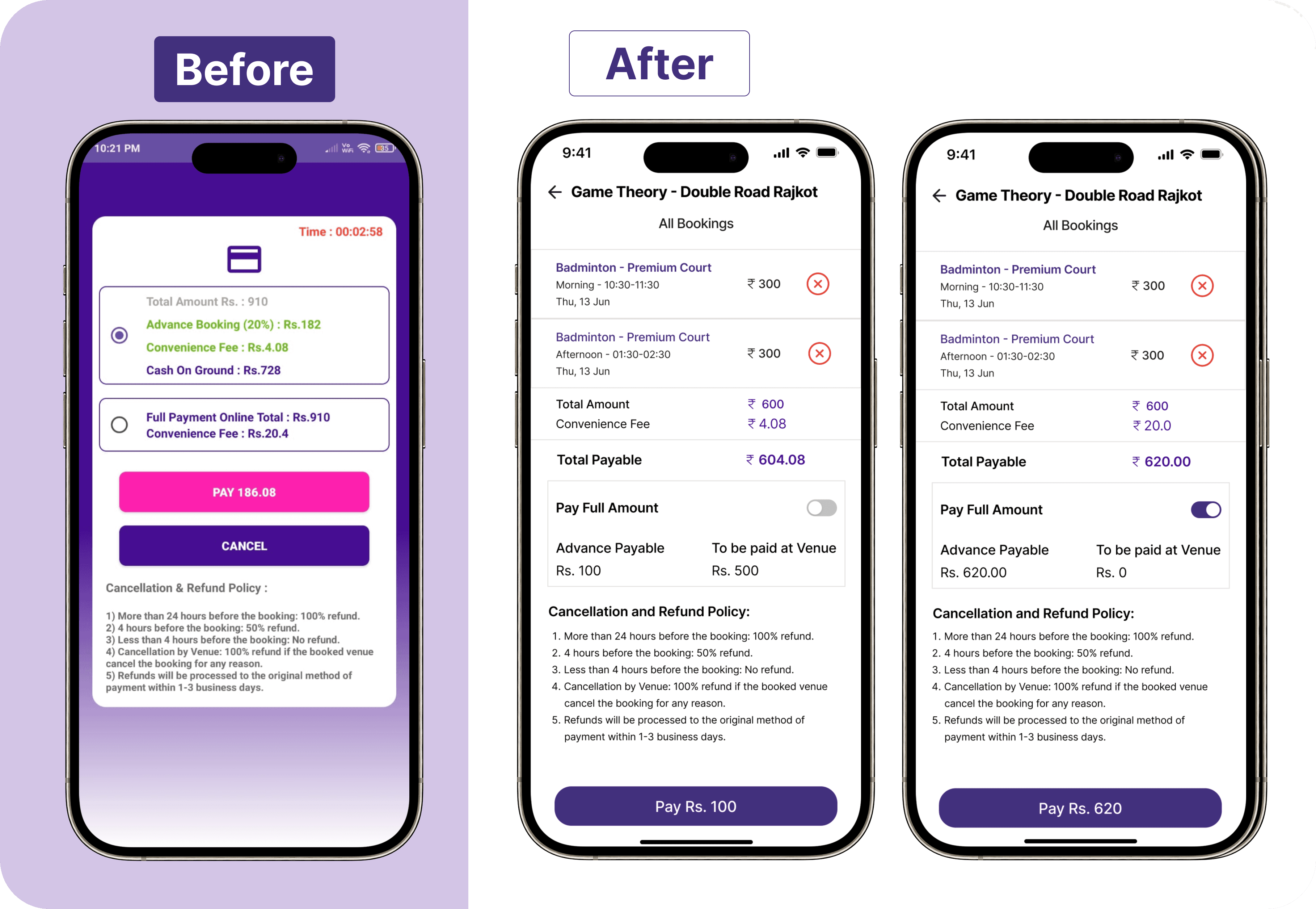
The payment screen was missing a few major pieces of information, it does not have a summary of the venue and court selected.
After carefully understanding the current flow and designs, I thought to redesign the booking experience of the app.
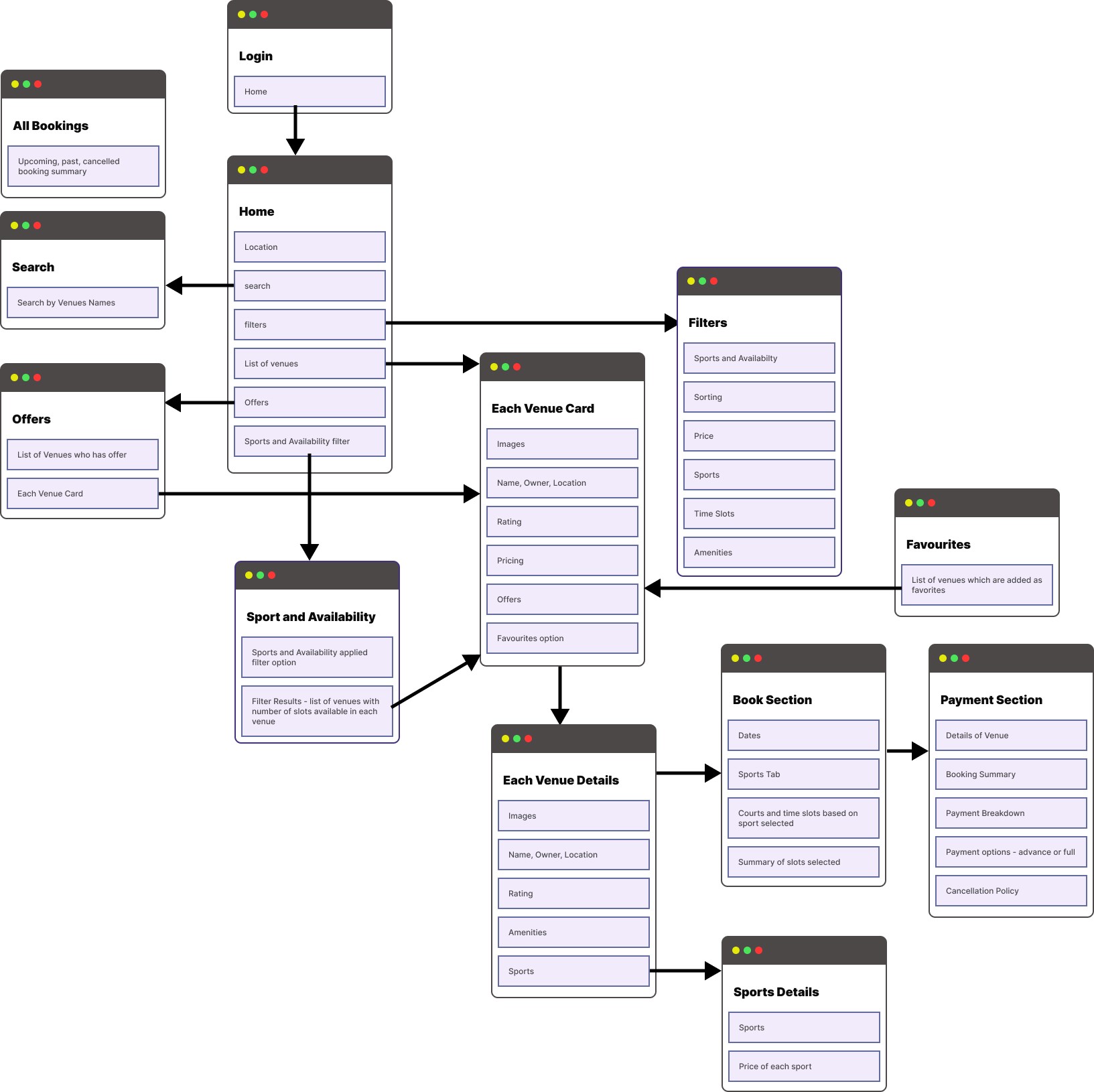
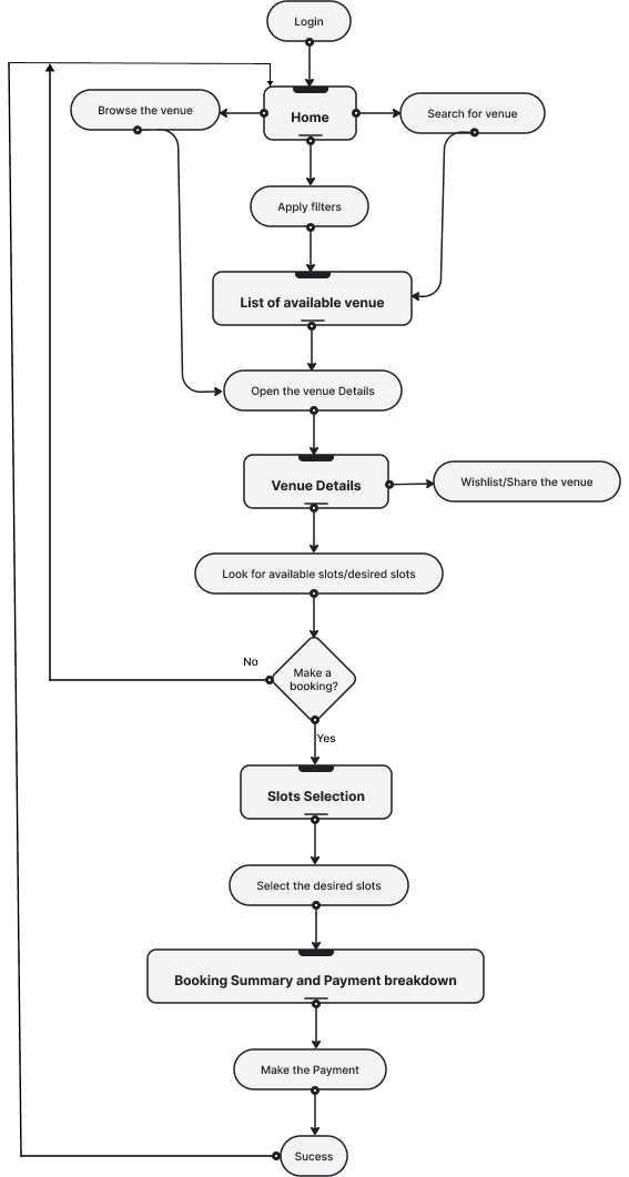
I started with understanding what needs to be included on screen to make a seamless user experience, I had gone through other sports apps like Playo, Huddle, and Khelomore to understand more about the information architecture, booking flow and design inspiration. And Finalise on below information architecture
Information Architecture
User Flow
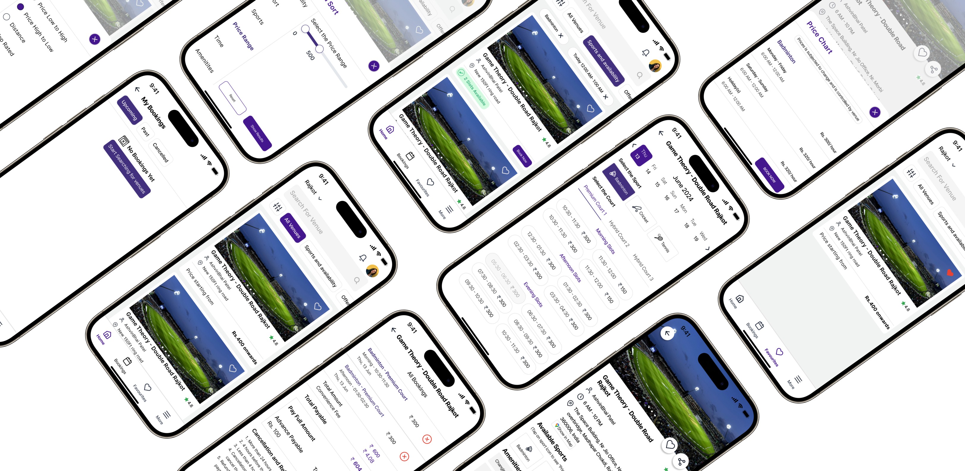
Application after redesign
Home Screen
I have prioritised consistency by maintaining a consistent visual style and keeping navigation elements in predictable locations, currently in the app for a few screens for the navigation we have to use device navigation.
Added multiple filters to easily find venues based on users' criteria.
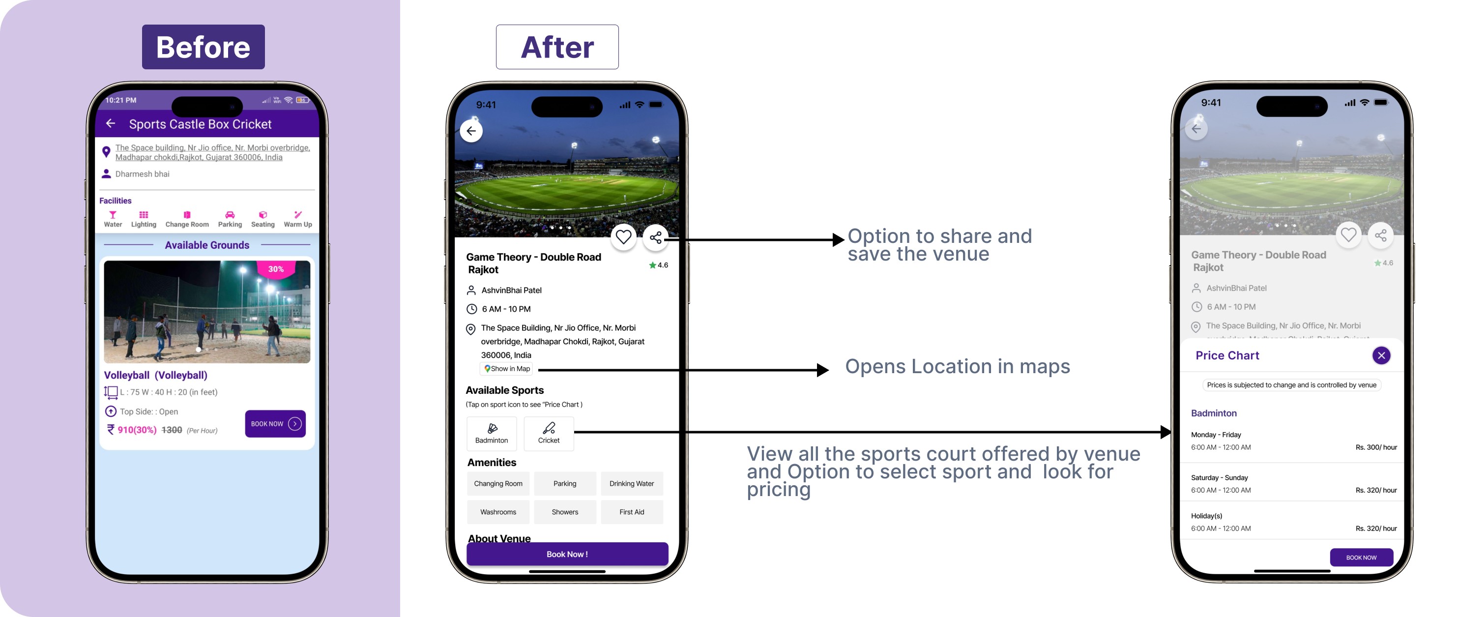
Venue Details Screen
Option to share and save venues helps user engagement.
Selecting Slots Screen
Rather than going home and searching for the venue for the different dates, adding multiple date options and a summary of the selected slots helps users experience and encourages repeat usage.
Summaries create a smoother, more predictable user experience by guiding users through a structured process.
Payment Screens
Adding a summary of the court bookings and payments helps users with Clarity and Transparency, and helps users review and ensure all the details are correct before finalising the transaction.
Summaries break down complex information into manageable chunks, making it easier for users to understand what they are paying for.
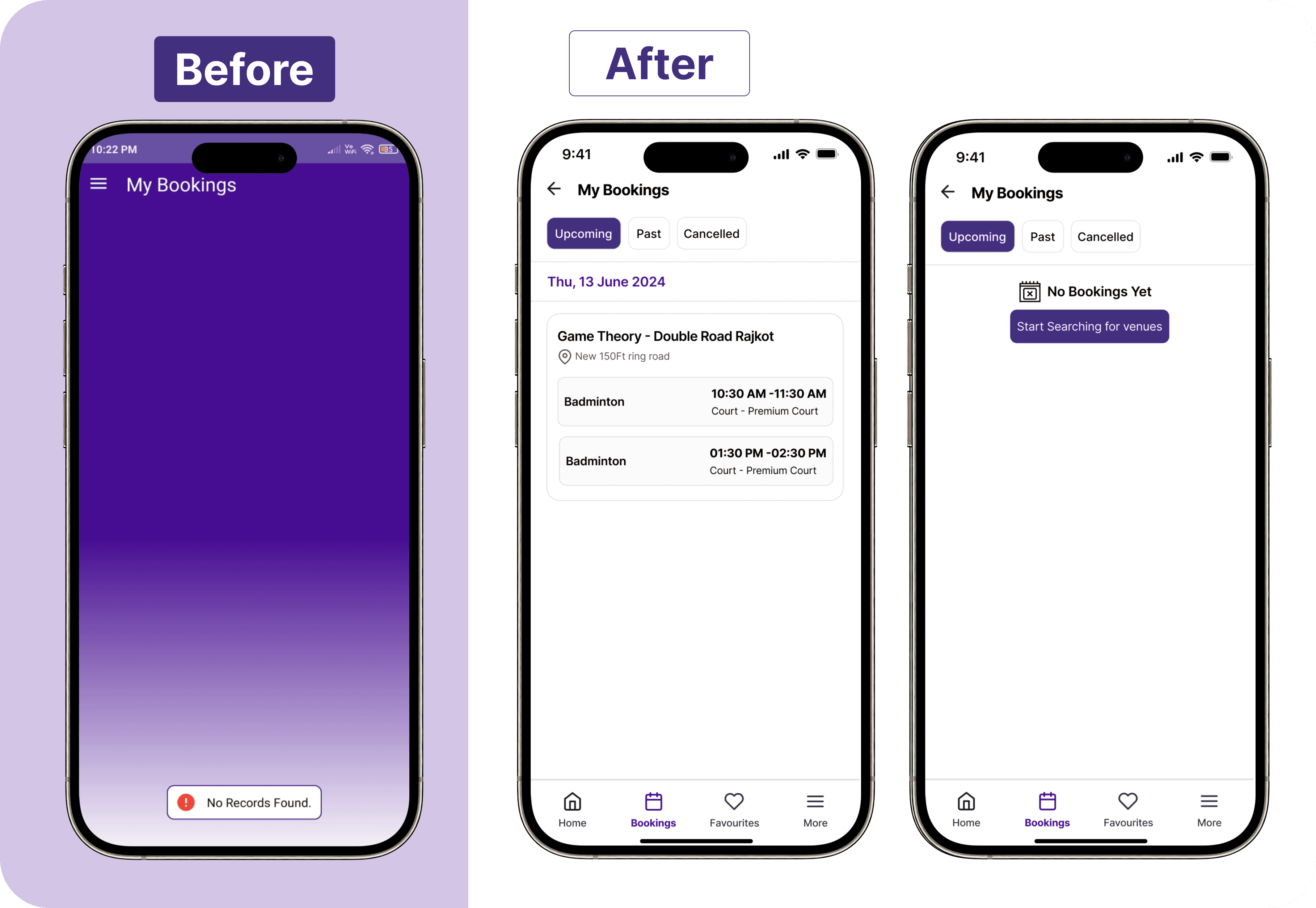
All Booking
Works as a calendar, indicating upcoming, past and cancelled booking.
The BookMyBox redesign emphasized user-centered design principles. By mapping user journeys, I identified pain points and implemented solutions like clear information architecture, intuitive navigation, and a user-friendly UI. These learnings can be applied to future projects to create exceptional applications.
Learnings
